Matplotlib 网格
向图表添加网格线
通过 Pyplot,您可以使用 grid() 函数向图表添加网格线。
实例
向图表添加网格线:
import numpy as np
import matplotlib.pyplot as plt

x = np.array([80, 85, 90, 95, 100, 105, 110, 115, 120, 125])
y = np.array([240, 250, 260, 270, 280, 290, 300, 310, 320, 330])

plt.title("Sports Watch Data")
plt.xlabel("Average Pulse")
plt.ylabel("Calorie Burnage")

plt.plot(x, y)

plt.grid()

plt.show()
结果:

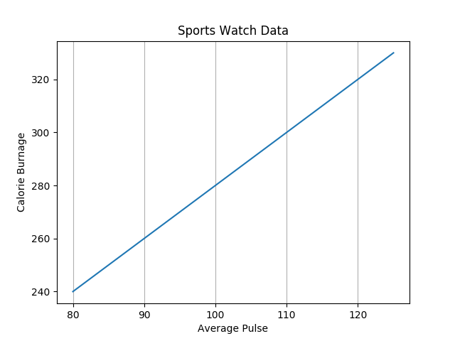
指定要显示的网格线
您可以使用 grid() 函数中的 axis 参数来指定要显示的网格线。
合法值包括:'x'、'y' 和 'both'。默认值是 'both'。
实例
仅显示 x 轴的网格线:
import numpy as np
import matplotlib.pyplot as plt

x = np.array([80, 85, 90, 95, 100, 105, 110, 115, 120, 125])
y = np.array([240, 250, 260, 270, 280, 290, 300, 310, 320, 330])

plt.title("Sports Watch Data")
plt.xlabel("Average Pulse")
plt.ylabel("Calorie Burnage")

plt.plot(x, y)

plt.grid(axis = 'x')

plt.show()
结果:
实例
仅显示 y 轴的网格线:
import numpy as np
import matplotlib.pyplot as plt

x = np.array([80, 85, 90, 95, 100, 105, 110, 115, 120, 125])
y = np.array([240, 250, 260, 270, 280, 290, 300, 310, 320, 330])

plt.title("Sports Watch Data")
plt.xlabel("Average Pulse")
plt.ylabel("Calorie Burnage")

plt.plot(x, y)

plt.grid(axis = 'y')

plt.show()
结果:

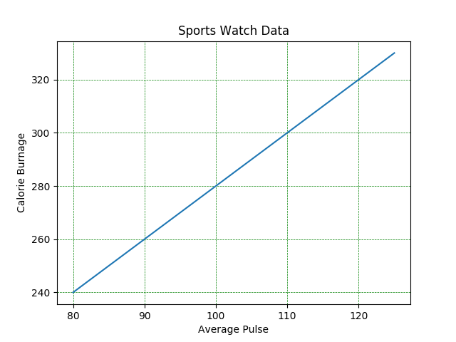
设置网格线的属性
您还可以设置网格线的属性,像这样:grid(color = '颜色', linestyle = '线型', linewidth = 数字)。
实例
设置网格线的属性:
import numpy as np
import matplotlib.pyplot as plt

x = np.array([80, 85, 90, 95, 100, 105, 110, 115, 120, 125])
y = np.array([240, 250, 260, 270, 280, 290, 300, 310, 320, 330])

plt.title("Sports Watch Data")
plt.xlabel("Average Pulse")
plt.ylabel("Calorie Burnage")

plt.plot(x, y)

plt.grid(color = 'green', linestyle = '--', linewidth = 0.5)

plt.show()
结果: